Our Guest Bedroom Remodel: Part 1 with Houzz
It was on my mind over the last few months to tackle a major guest bedroom remodel. We moved into a 60 year-old, mid-century ranch style home and it definitely needed some updating. The guest bedroom needed to make a move from the era of I Love Lucy into a more modern age. With the help from some brands I love, I was able to put this fabulous project into motion from start to finish. The guest bedroom remodel just wrapped up and I couldn't be more pleased with the outcome.
photography | xoxo wedding studio
This post was sponsored in part by Houzz. Because of brand partners such as these, I am able to produce content that I am proud of and love sharing with you!
Our Guest Bedroom Remodel Project with Houzz: Part 1
Since our return from Toronto, we've been living in my husband's nana's home. A little backstory. We were looking to buy in San Diego but found it really difficult to do from Toronto. Nana had just moved out of the family home they've owned in La Jolla since the 50's. Needless to say, it was great timing and we moved in. We've have been renting it, while going back and forth contemplating buying, ever since.
From a person who loves style, it's been really difficult for me to sit back and wait. But for a year, wait I did. But last spring, an opportunity came up and I tackled the backyard/pool area with a little patio furniture update. From that moment, the style itch started to grow inside the home. And in October, when I could see the holidays looming on the horizon, I knew I wanted to tackle a guest bedroom remodel.
Before | The Guest Bedroom Remodel
Please, please don't laugh to hard at the condition of this room. These before pictures are just a glimpse into the massive love affair that went into creating a soon-to-be zen-like space. This was just as we were deciding on the paint color of the room. We went with Dunn Edwards Carrara which was right in the middle of not too white and very away from yellow. At one point, there were two twin beds in here, hence the I Love Lucy reference!
The Guest Bedroom Remodel Design Inspiration - Working with Houzz
There are a few resources I love to use when I'm brainstorming design ideas and gathering inspiration. Obviously, Pinterest is a big player in pinning the rooms of my dreams but where it really becomes a reality is using Houzz. I've been using Houzz as a source of room inspiration for a few years now. On the Houzz site, I started the guest bedroom remodel by creating a 'Guest Bedroom Ideas' ideabook. The goal was to have the room to reflect warmth, a zen-like feel, and a modern midcentury feel. To do that, I was on the lookout for warm wood pieces and lighter color palette to achieve that balance.
I started my room inspiration search on the Houzz site by department, mainly bedroom, then narrowed my style search to midcentury. From there, all the inspiration pieces were saved to my ideabook. I was on the hunt for a rug, a piece to hang on the wall, and a bedside table. There was a lot of back and forth between a few side tables and a particular rug. To make it easy, I printed out my favorites to compare. It was so helpful to have those images saved in my ideabook to refer back to whenever I wanted. Houzz has created a shoppable page with thousands products. So rather than clicking away from their site, I was able to click directly on a product to make a purchase.
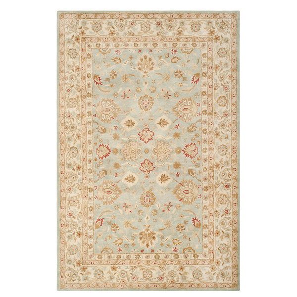
Miles, ever the tried and true assistant, helping me make the final flooring decision based on our new Houzz Safavieh blue/grey rug. (See below) We opted for a neutral rug that would help lighten the room overall. For the flooring, we choose the far right, which was XP Riverbed Oak laminate wood flooring from Home Depot.
Here are some of the final pieces that I ended up ordering from the Houzz shop:
This is the Safavieh rug in blue and grey in 100% wool
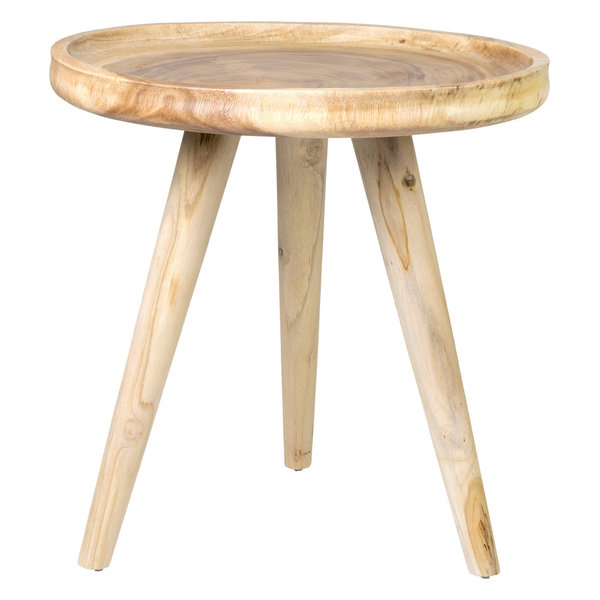
This mid-century Wood Round Accent Table
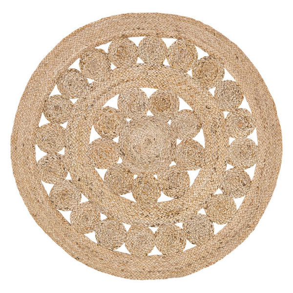
And this 3' Round Celeste Jute Rug to hang on the wall
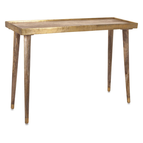
And the final purchase was this Graceful Dane console table that fit right underneath our window nook
After | The Guest Bedroom Remodel Final Reveal
Design-wise, I've been really inspired by clean lines and a quiet color palate. The inspiration behind the guest bedroom remodel was based on era of the home. Because the home is over 60 years old and built during the mid-century, the home has character. Think brass finishes, gold framed closet windows, the good stuff, ya know? These days, you can't find homes with that type of detail anymore.
During the entire decorating process of the guest bedroom remodel, I kept in mind that I wanted the room to make a guest feel like they were relaxed, in a home away from home. The natural elements of warm woods and greenery helped to tie that all together. Overall, I think we maintained the mid-century feel and thanks to Houzz, our guest bedroom remodel looks amazing. What do you think about the before and after?!? Stay tuned next week for Part 2: Room Details!


